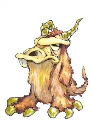
Here are some highlights from my work in paint and illustration. Drawing and painting have been a crucial part of my life for as long as I can remember.
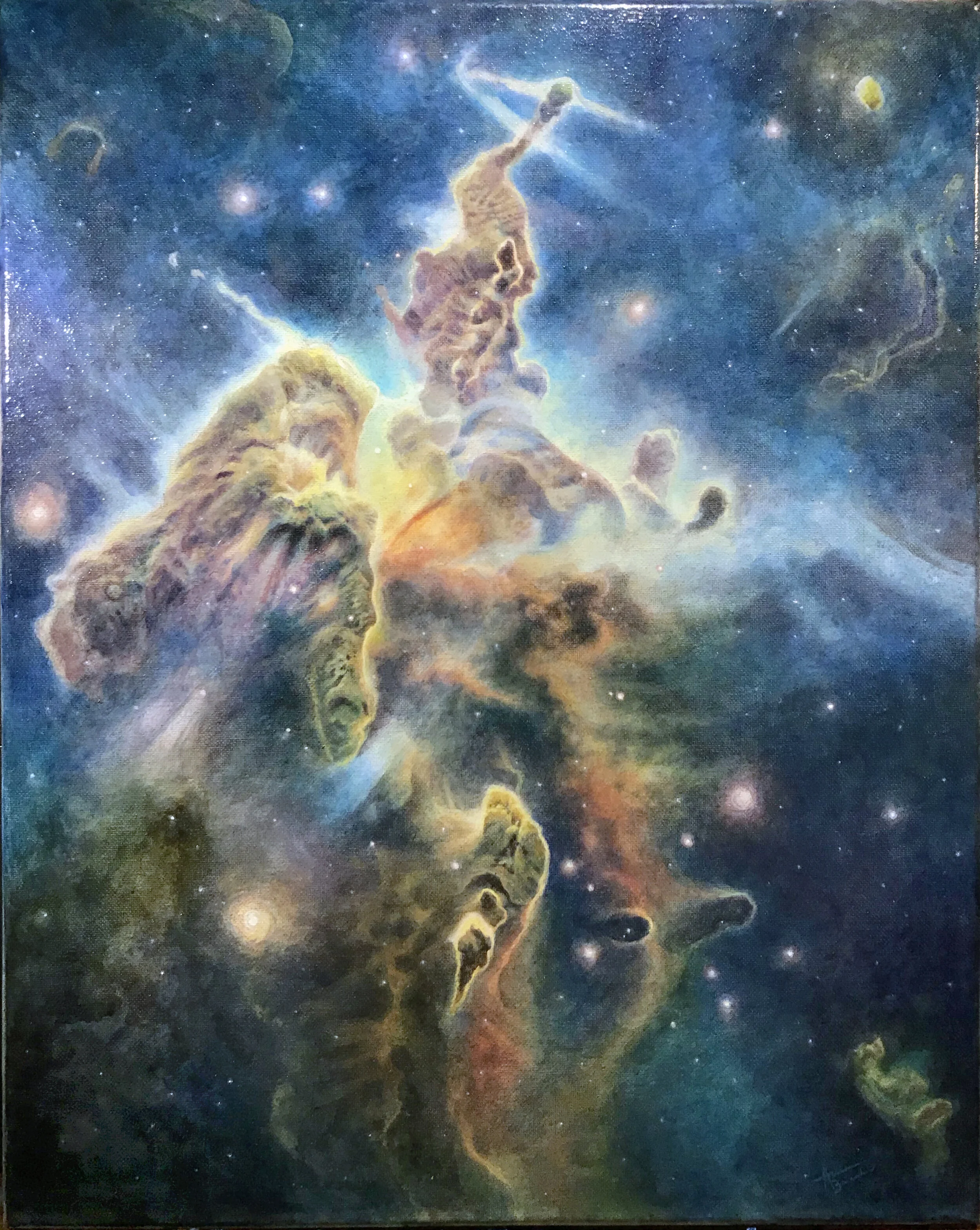
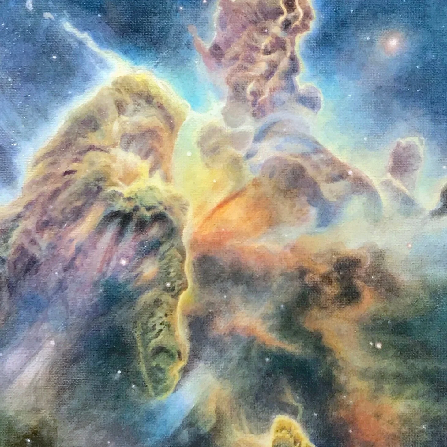
16”x20,” Oil paint, varnish, and glazing mediums on canvas. This piece is all about process. It is composed of layers upon layers of tinted glaze, which produces an almost holographic dimensional effect when viewed in person.
Inspiration:
“Remember to look up at the stars and not down at your feet. Try to make sense of what you see and wonder about what makes the universe exist. Be curious. And however difficult life may seem, there is always something you can do and succeed at.”
- Stephen Hawking
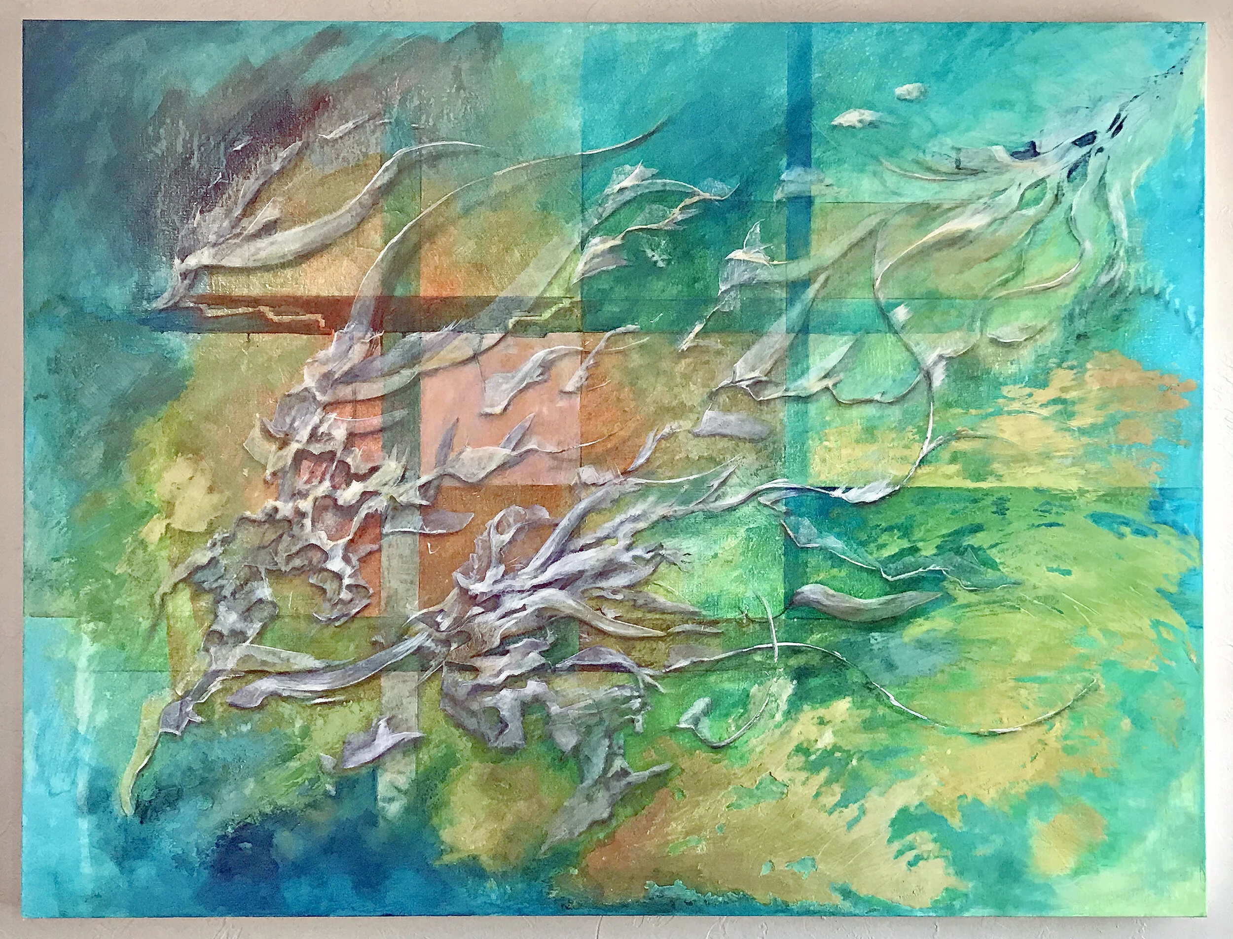
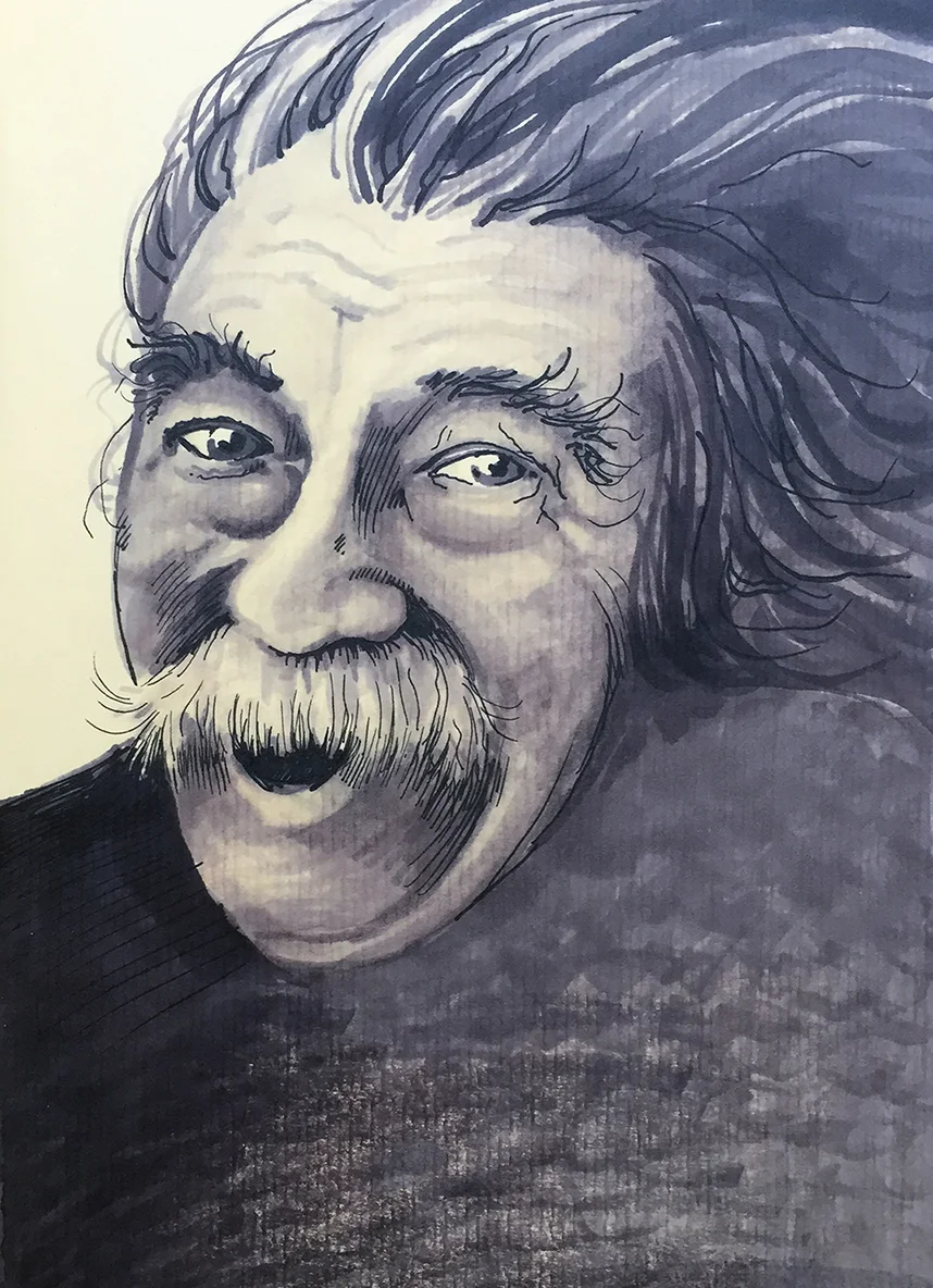
3.5’ x 3,’ Fluid Acrylic, Gesso, Charcoal, Pastel on canvas.
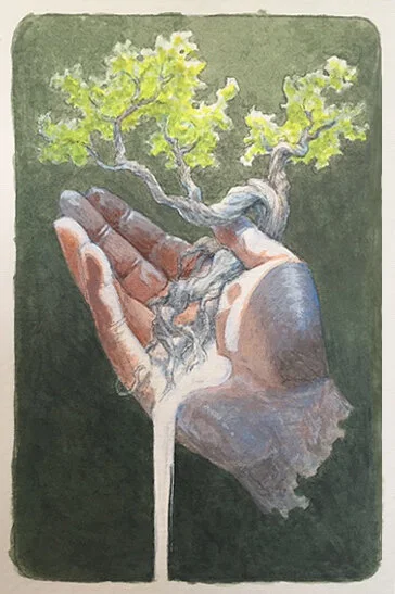
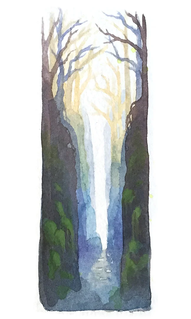
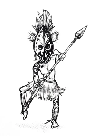
7”x4,” Gouache on watercolor paper
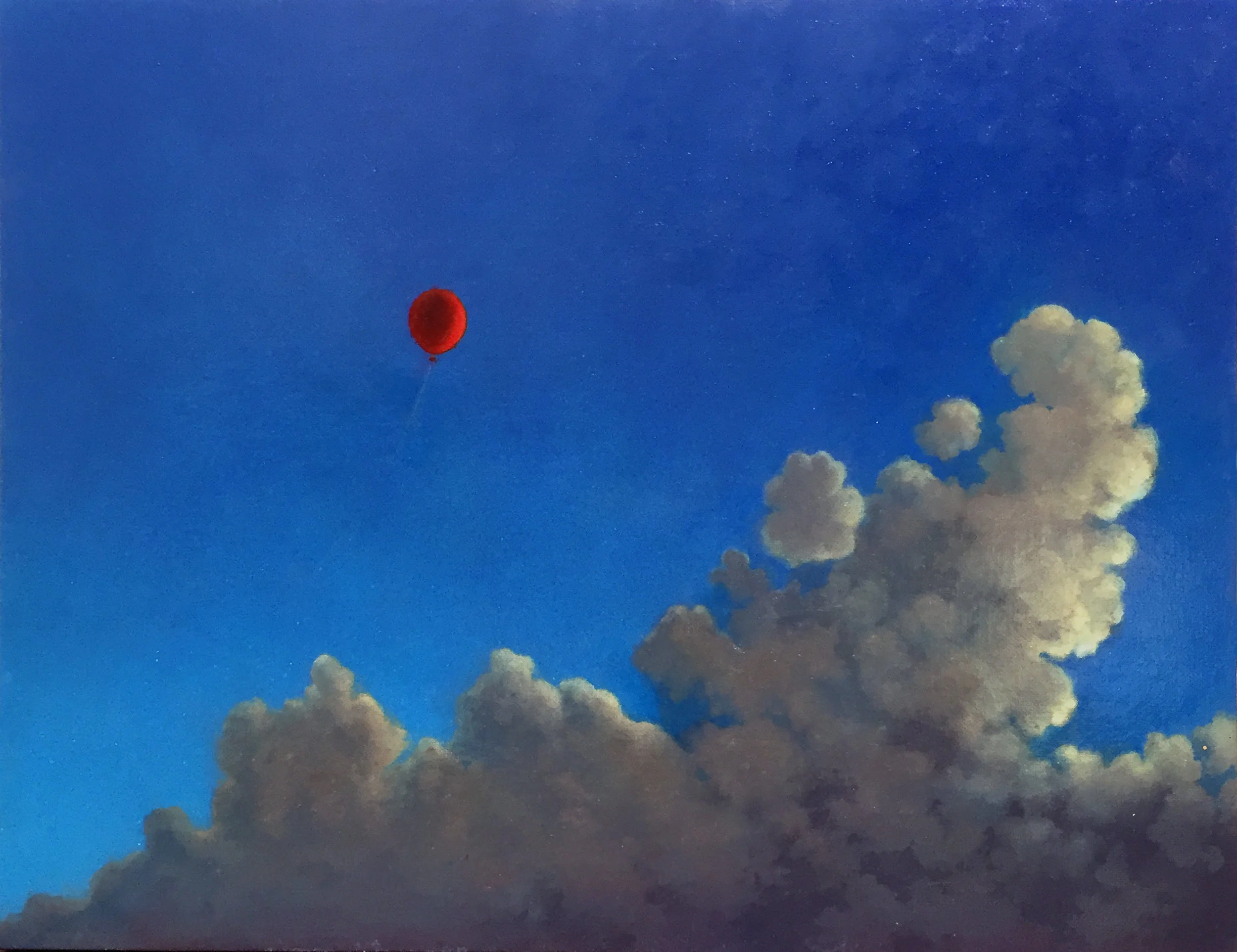
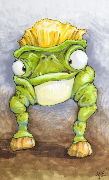
16”x20,” Fluid acrylic on canvas.
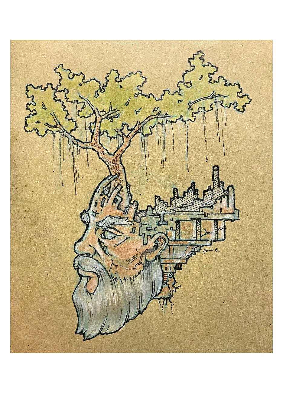
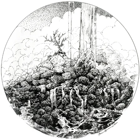
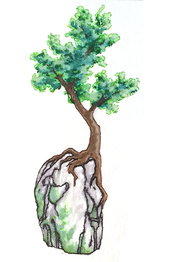
2.5’ x 3.5,’ Graphite, Conte, Pastel on prepared surface. Based on the sentence: “A mind’s capacity to further its own evolution is unlimited.”
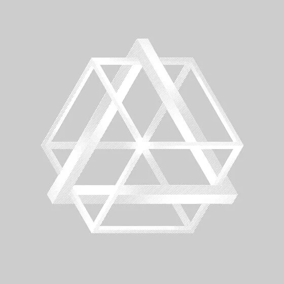
Here are some of the many logos I have designed. Creating a logo is one of my favorite types of design, as it is a principally a functional art and science. Everything in the composition has to have purpose, and I prefer to build marks that do some visual marketing work for the business it represents.
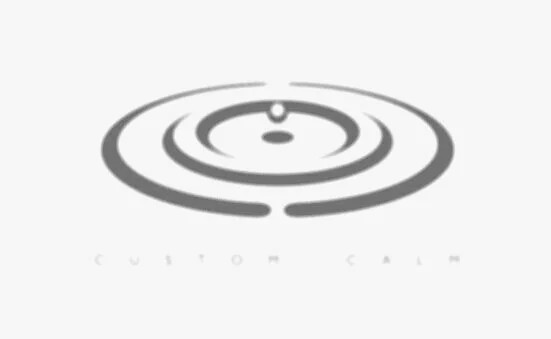
This logo was for a custom chronic pain management coach and yoga instructor. If you take a close look, you will see two C's reflected in the water ripples.
This is a recent project done for a new social media management company. The goal was to integrate and convey the ideas of "social" (two figures connecting with a spark between them), the owl form, and a "G.O." for the company name simultaneously. The client had a loose idea of the feel she wanted, and, well here is her testimonial:
"AHHHH I am in love! I honestly cannot believe how you nailed everything I wanted but couldn’t articulate very well!! Amazing. Thank you!!!" - SJ, Atlanta, GA
For a web merchant company who sells practical products for plus-size people that make their lives easier. They also have a community portal aspect, and the idea was to integrate Self-love & Happiness with the Company "M." The center form can be used independently from the outer form for various marketing.
A logo for a juggling & comedy performance duo in Boulder, CO. They have quite a specific themed show that tells the story of the tension between these two wildly different gentlemen. Even though one is straight-laced and science-minded and the other a wild and chaotic clown, they come together to realize they are greater together working as a team.
Built for a large Makerspace networking event, this logo needed to build on the branding of comakerhub.org, a parent organization whose mission is to unify maker resources in Colorado.
This logo was done for an international charity organization whose mission is to uplift and assist anyone who is in need. Hafsa is an Arabic name meaning "Young Lioness" or "Cub." And Zaynab means "Fragrant Flower." You might notice that the flower petals are actually stylized hands reaching out in every direction, and the center is the face of a lion cub.
This logo was done for a coffeehouse bakery that caters to kids and adults. The client wanted an organic sort of feel to the visual idea, and was very happy with this result.
Built for a Cancer Counseling Group, this logo had to include the image of a crab as a symbol for cancer, and I was able to literally build the image out of the letters "BYM." Take a close look, and you'll see them hiding in plain sight!
This is a healthy foods vending company in Atlanta, GA. They wanted to incorporate several ideas together elegantly, including: Georgia, All-Natural, and the convenience of vending as a healthy alternative.
This logo was the cornerstone of a rebranding campaign for a restaurant in Atlanta, GA. They gave me some specific parameters such as: Fish bones with chef's hat, cityscape, and a "stamp" or "seal" look. They were absolutely ecstatic with this piece, and ended up having a huge print of it done for their restaurant awning sign.
Done as a bar/lounge concept piece as a branding exercise. The business never came to fruition, but it was a fun project none the less!
Built for a friend's climbing gym concept in Austin, TX. I don't think he got the funding to build his dream business, but it was a great project to work on.
Constructed for a visual assets company whose focus was on video and motion graphics. I actually came up wth the name while in a meeting with the owners, and they decided to use it, and I built this logo for the cause. One of the more complex pieces I've done to date.
This mark was done as a rebranding for the Pediatric wing of a newly renovated hospital. It had to include their old logo to maintain consistent brand guidelines, but bring something new to the concept for the new addition.
Built for the chairwoman of: "Women Entrepreneurs Collaborating And Networking."
A sampling of internal / organizational materials, technical illustration, infographics, newsletters, and industry-specific marketing collateral can be found here. I am often handed a lot of parts and parameters, with such challenges as too much information or limited space, and asked to prioritize and design more functional, readable pieces.
This piece contains the company vision, core values, strategic breakdowns, and metrics for how to stay on track for goals, so that everyone can see them. The challenge was to make the information easy to follow, and engaging with color and organization.
This is a page from a digital presentation that was designed to also be printed as a leave behind book after a meeting. There was lots of branded infographics and layout challenges in this project.
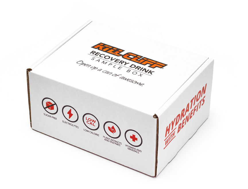
This poster was intended to illuminate the beneficial ingredients that go into the standard product that the company sells to consumers and gyms.
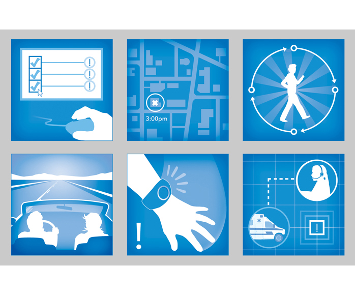
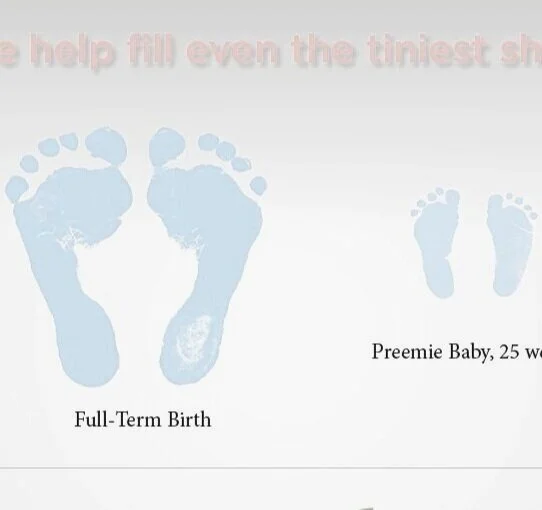
These are functional illustrations to show the process that customers can expect after purchasing this flagship product.
Here you will find a range of graphics that I've designed for websites, digital and email marketing campaigns, as well as social media.
Concept branded promo image for a Cloud 9 Bar & Lounge
This is a series of photorealistic 3D renderings done for a product catalogue and promotional / sell sheets.
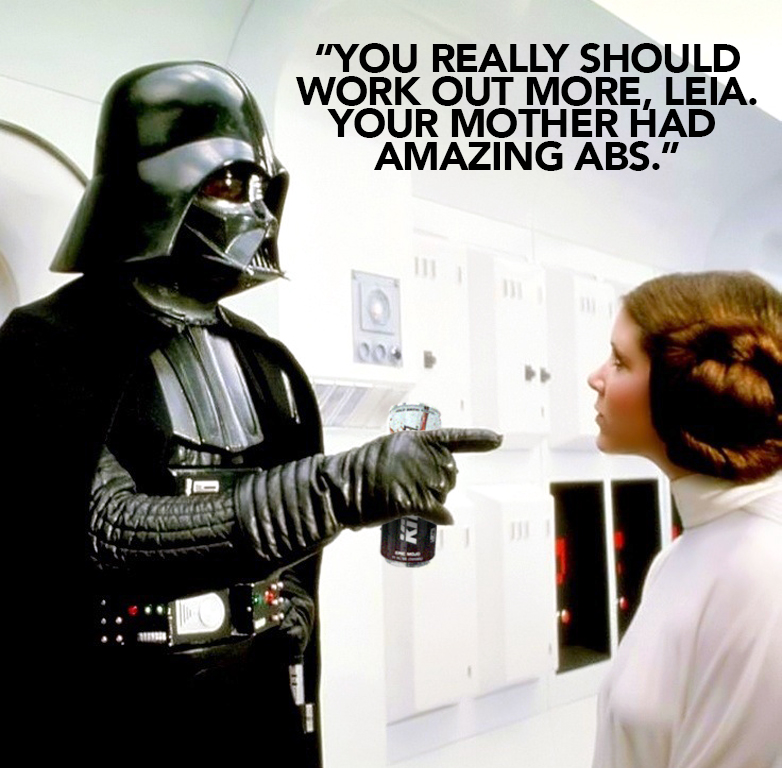
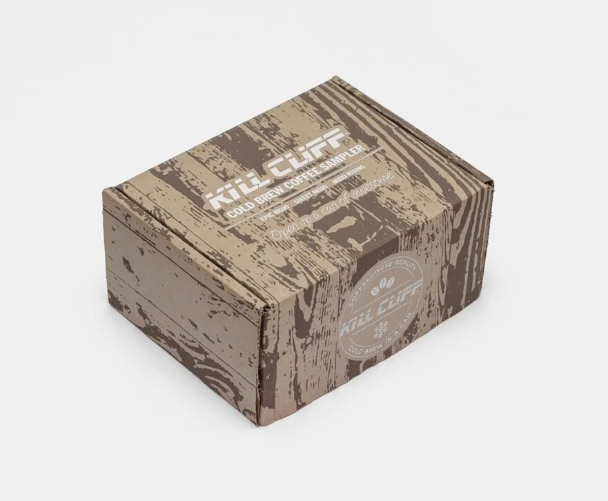
This piece was used to promote Kill Cliff cold brew coffee in a can (black coffee).
Promoting their new cold brew coffee in a can.
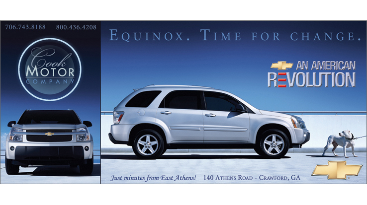
Here you will find some of my advertising work including production art for billboards, mailers, and various sizes of print ads for magazines.
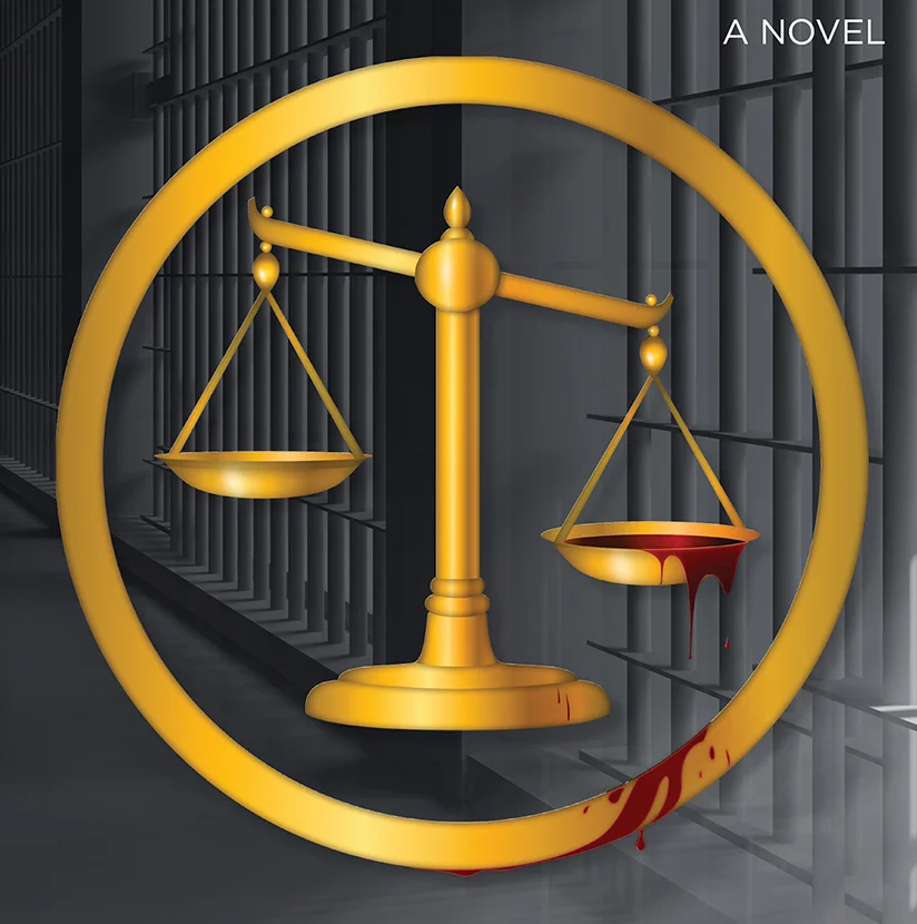
In this section are: book covers that I've designed and done photography for, book layouts (all text layout in book), promotional rack cards, event banners, business cards, CD/album sleeves, and bookmarks.
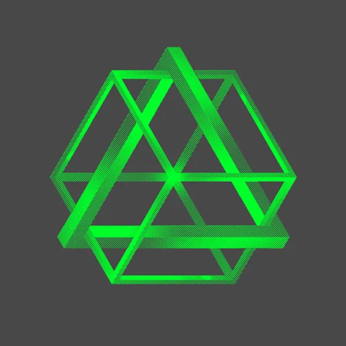
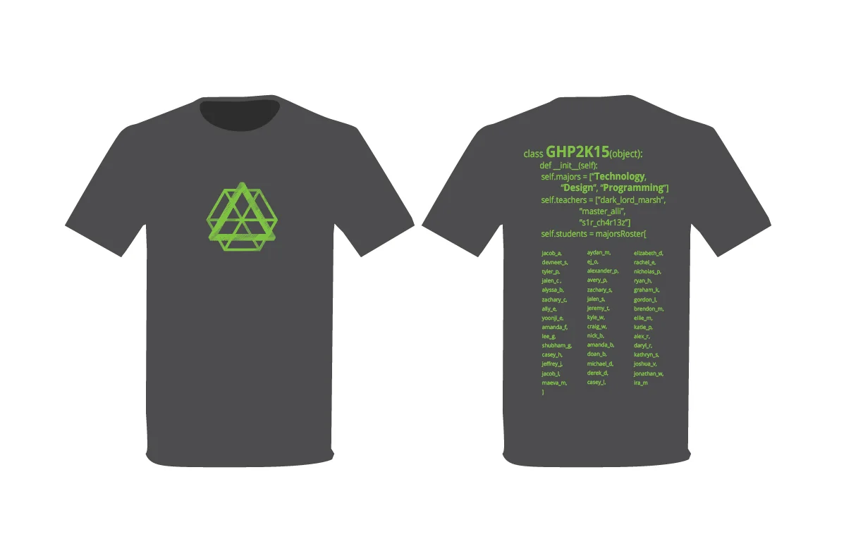
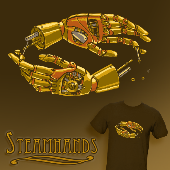
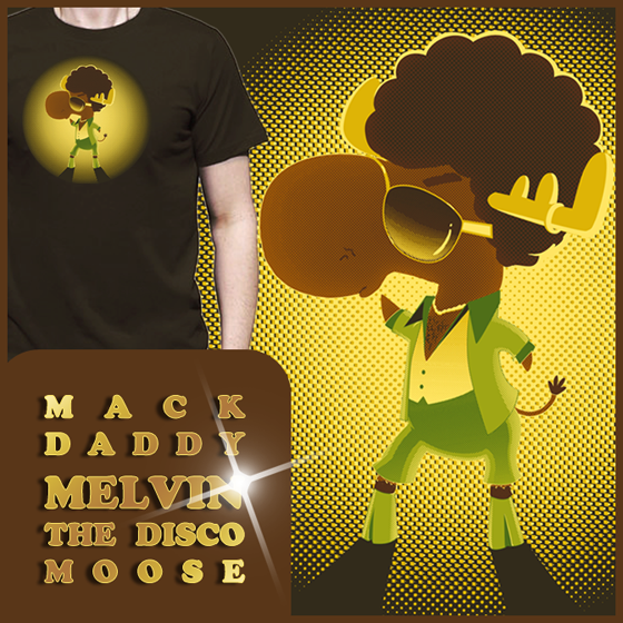
Here are some examples of T-shirts that I've designed for various purposes.
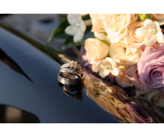
From food photography to weddings, to product shoots and serendipitous moments in diverse locales, here you can take a look at a group of my favorite captured images.
Bottomless Lakes, NM
Athens, GA
Kansas
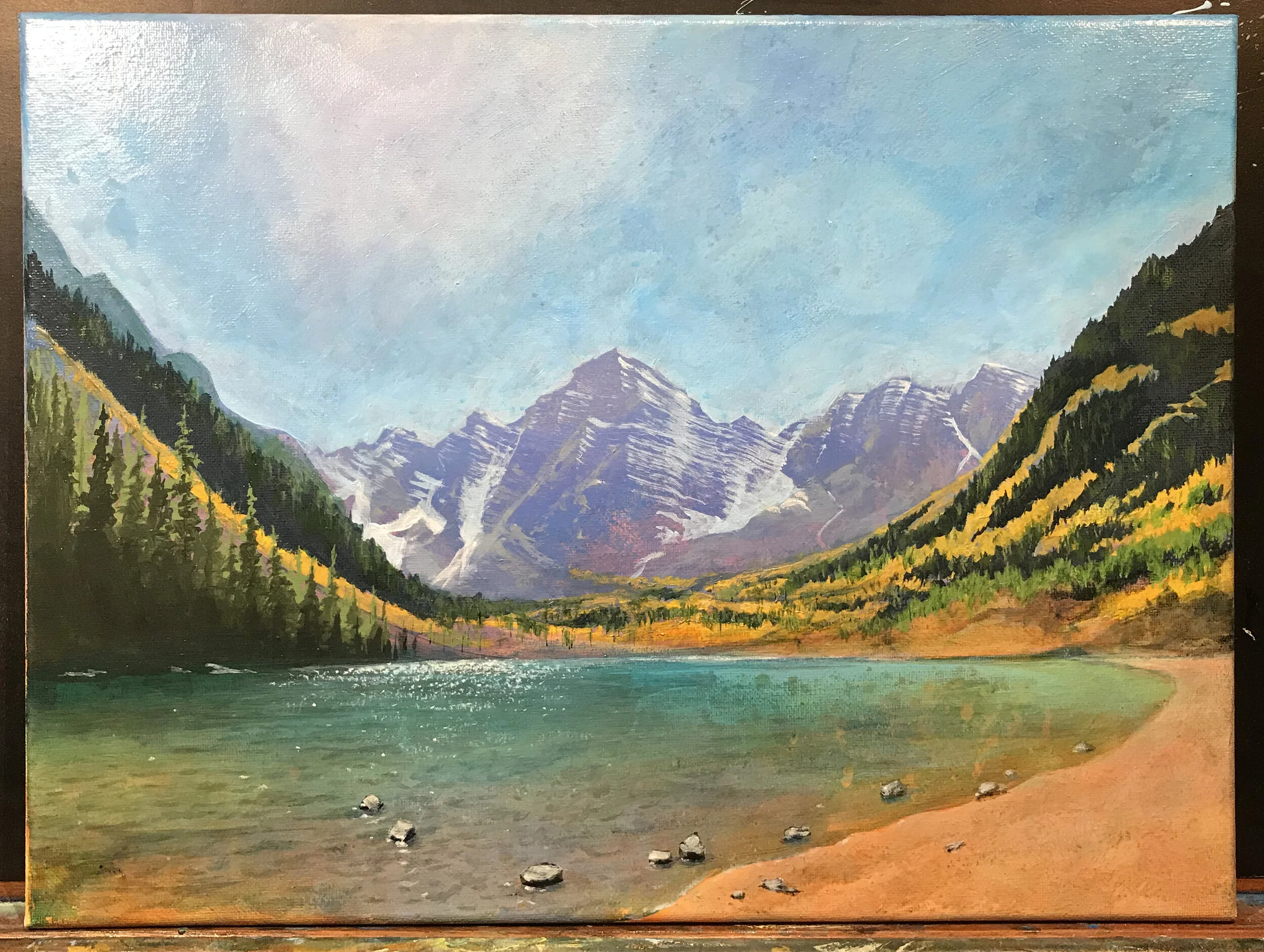
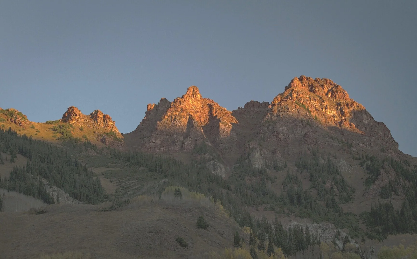
Maroon Bells Campground, Aspen, Colorado